

The past in Israel is unpredictable. (Part 1,453,692)
There’s an old Soviet joke that goes like this: “The future is certain; only the past is unpredictable”.

Well, for those who trusted the Israeli MOH data - the joke is on you.
For many months, Israeli citizens struggled with draconian “green pass” measures that subjected them to house arrests and loss of freedom of movement, access to medical treatment, schooling for their kids, their ability to earn a living, and their sense of dignity.
Whenever the issue was brought to the Knesset committees, the courts, or the media, there was always the same claim:
”The unvaccinated were posing a greater risk to the public than the vaccinated.”
The data that formed the basis of this false argument was taken from Israel’s Covid19 dashboard, which can be found here:
https://datadashboard.health.gov.il/COVID-19/general
The 28.4.22 version is here:
https://web.archive.org/web/20220428013918/https://datadashboard.health.gov.il/COVID-19/general
It now turns out that the data was (again) rigged.
The “green pass” has now died out and discriminatory measures against the un-vaccinated are largely gone, with a few exceptions.
Then, one fine day in early May, the historical data in the Israeli dashboard retroactively changed to resemble what we have seen before in so many countries:
A very strong and persistent negative efficacy of the vaccine against infection, which goes way back.
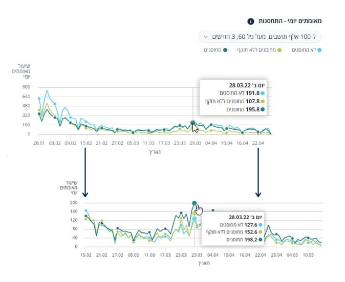
A. Number of confirmed cases per 100,000 people under 60:
End of April:

And now….

B. Number of confirmed cases per 100,000 people over 60.
End of April:

And now….

When it comes to Covid19 data from Israel, the past is not just unpredictable – it is nefarious and based on fabricated data. Time and again.
Don’t forget which country managed to so successfully “de-vaccinate” its population:

First 4 figures: "before and after" "below and above 60". What is the fabrication? Just a change in beginning and end dates, just an expansion of vertical scale, just a compression of horizontal scale!
I do see the problem with the vaccination rate. Either a fabrication or a big error in collecting accurate data. I saw tweets about this in September and October 2021 by @BoonehElad and others suggesting forgery.
The bottom graph looks like Dominion's count of Trump's votes on election night suddenly dropping. Somehow.
The other graphs appear to me to represent the shot's waning effect over two different time periods, if I'm reading the bottom correctly. It doesn't look revisionist, but it does seem to underrepresent the true negativity of efficacy.